
Infographics have become a powerful tool in digital communication. Their ability to convey complex information quickly and engagingly makes them a favorite among educators, marketers, and content creators. Understanding the ins and outs of infographics can help you leverage them effectively. In today's fast-paced world, where attention spans are short, the importance of concise and visually appealing content cannot be overstated. Infographics serve this need perfectly by distilling extensive data and information into appealing visuals. These visuals capture attention and enable a quicker and clearer understanding of various topics, ranging from educational content to marketing strategies.
Furthermore, the versatility of infographics allows them to be used in various fields. Whether it's for teaching a complex scientific concept, presenting business data to stakeholders, or simply engaging readers with compelling visual stories, infographics have the potential to elevate the content significantly. Educators often use infographics to enhance learning experiences by presenting information in a visually structured manner. Marketers, on the other hand, leverage them to create shareable content that can attract and retain audience attention more effectively than plain text.
Content creators find infographics invaluable for enhancing engagement metrics. A well-crafted infographic not only captures the audience’s attention but also improves comprehension and retention of the information presented. This becomes particularly important in digital marketing, where high engagement rates can significantly impact the success of campaigns. By incorporating infographics into their content strategy, marketers can improve user interaction, boost SEO rankings by increasing page dwell time, and encourage social media shares, thereby amplifying their content's reach.
Given the widespread availability of design tools, creating infographics has become easier than ever. Platforms like Canva, Piktochart, and Adobe Spark offer user-friendly interfaces and customizable templates that can cater to different needs and preferences. These tools democratize the design process, enabling individuals without a graphic design background to produce professional-quality infographics. As a result, more and more people are utilizing infographics to communicate their messages effectively and stand out in the crowded digital landscape.
To make the most out of infographics, it is crucial to balance form and function. The design should be visually appealing but not at the expense of clarity and accuracy. Misleading visuals can distort the information and damage credibility. Therefore, it’s vital to ensure that the data presented is accurate, the design elements are well-chosen, and the overall narrative is coherent. This balance helps create an infographic that is not only attractive but also informative and trustworthy.
Another essential aspect of effective infographic use is understanding the audience. Tailoring the design and content of the infographic to meet the preferences and needs of the target audience will enhance its impact. For instance, an infographic intended for a professional audience may use a more formal design and comprehensive data, while one aimed at a younger audience might employ vibrant colors and simplified information. This audience-centric approach ensures that the infographic resonates with its intended viewers, making the communication more effective.
In summary, infographics are a strategic asset in digital communication. Their combination of visual appeal and information efficiency makes them an indispensable tool for conveying messages in our visually-driven world. As long as they are used thoughtfully and creatively, infographics can significantly enhance content delivery, engagement, and memorability, making them a vital component of any communication strategy.
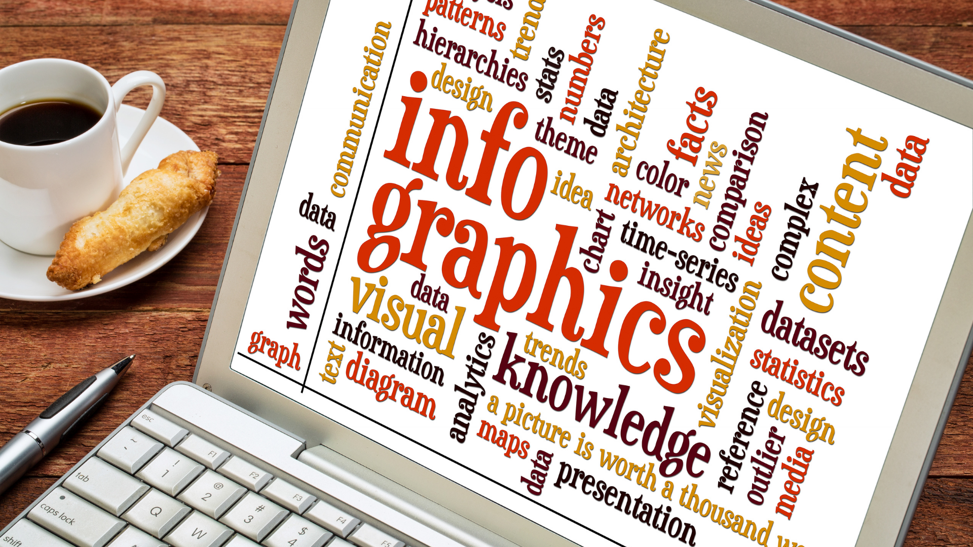
An infographic is a visual representation of information, data, or knowledge intended to present information quickly and clearly. By combining text, images, and design, infographics can turn complex ideas into digestible, visually appealing content.
The primary goal of an infographic is to make the information more accessible. Unlike lengthy articles or dense reports, infographics can distill key points into an easy-to-understand format that can be quickly scanned by readers. This makes them ideal for presenting data-driven insights, educational material, and even marketing content.
An interesting aspect of infographics is their versatility. They can be tailored to suit various types of information and different audience needs. For instance, an educational infographic may use charts, diagrams, and icons to break down concepts and ideas for students. In contrast, a marketing infographic might employ flashy graphics and persuasive text to capture consumer interest.
Another significant advantage of infographics is their capacity to enhance memorability. Studies have shown that people are more likely to remember information presented visually, making infographics an excellent tool for emphasizing key messages. The combination of visuals and text can help reinforce learning and retention.
With the rise of digital technology, the use of infographics has become even more prevalent. Websites, blogs, social media platforms, and online newsletters frequently use infographics to engage their audience and communicate messages effectively. The visual appeal of infographics ensures that they stand out amid the digital noise, attracting and retaining readers' attention.
Moreover, the design of a well-crafted infographic involves an element of storytelling. By guiding the viewer through a logical progression of information, an infographic can not only inform but also engage emotion and curiosity. Effective infographics often use a narrative structure to make data and insights more relatable and compelling.
In summary, the defining characteristic of an infographic is its ability to transform complex or extensive information into a format that is both engaging and easy to understand. Whether used for education, marketing, or data presentation, infographics are a valuable tool in the realm of visual communication.
Infographics offer multiple benefits that can make your content more engaging and memorable:
There are various types of infographics, each serving a different purpose. Selecting the right type of infographic can significantly impact how your information is perceived and understood by your audience. Let's delve into the specifics of the different types of infographics available, which will help you choose the most effective format for your needs:
Understanding these different types of infographics can help you choose the most appropriate format for your content, thereby ensuring that your audience can easily digest and engage with the information presented. The right type of infographic not only enhances comprehension but also makes your content more visually appealing and memorable. Consider the nature of your information and the needs of your audience when selecting an infographic type to ensure maximum impact and effectiveness.
Various tools and resources are available to help you create stunning infographics. Websites like Canva, Piktochart, and Adobe Spark offer customizable templates and examples that cater to various needs, from business presentations to educational materials. These platforms provide an extensive library of pre-designed elements, such as icons, charts, and images, which can be easily dragged and dropped into your design, ensuring that even those with minimal design experience can create professional-looking infographics.
Canva is particularly user-friendly, offering a wide range of free and premium templates that can be tailored to suit your specific goals. Whether you're looking to visualize survey results or explain a complex process, Canva's extensive template library can be a game-changer. Its collaborative features also make it easy to work with team members, allowing multiple users to edit and comment on the same project in real-time.
Piktochart stands out with its focus on converting data into engaging visual stories. It provides various templates designed specifically for different types of infographics, such as statistical infographics or timelines. The platform also offers tutorials and tips on how to make the most out of your design, ensuring that your infographics are not just visually appealing but also effective in communication.
Adobe Spark, on the other hand, integrates seamlessly with other Adobe products, making it a great choice for those already familiar with the Adobe Creative Suite. It offers a variety of templates and design elements, allowing for high levels of customization. Adobe Spark also enables users to easily switch between different media types, like turning a infographic into a video or web page, providing multiple ways to share your content.
Another valuable resource is Venngage, which specializes in creating infographics that are data-driven and highly informative. Venngage offers templates that range from beginner-friendly to highly advanced, catering to different levels of design expertise. Their platform includes features like a built-in color scheme generator and infographic tutorials to help you craft compelling visual content.
In addition to these platforms, Template.net is a versatile resource that offers downloadable infographic templates compatible with software like Microsoft PowerPoint and Google Slides. These templates come in various styles and themes, from minimalist designs to more intricate layouts, making them suitable for different types of content and audiences. The platform also offers customization options to ensure the infographic aligns perfectly with your brand's visual identity.
Finally, tools like Easel.ly focus on simplifying the infographic creation process. Easel.ly offers a range of templates that are easily customizable, even for users with no prior design experience. It provides drag-and-drop functionality, making it simple to add, remove, or modify design elements. Additionally, Easel.ly's intuitive interface ensures that you can create effective infographics without spending hours on design work, making it an ideal choice for those on a tight deadline.
Creating an effective infographic involves several steps:
Test and Revise: Review your infographic and make necessary adjustments. Show it to a sample of your target audience for feedback. Tools like A/B testing can be valuable here. Look for areas where the message might seem unclear or the visuals may cause confusion. Revise accordingly to ensure the final product is both informative and visually appealing.